
HOSPITALITY DESIGN
Burro
Covent Garden
RECOGNITION
Winner INT Interior Design Awards 2026
Finalist Mix Awards 2026
Finalist SBID Design awards 2026
Shortlisted IHPA 2026
THE BRIEF
Create the welcoming, inclusive spirit of a local restaurant in the very heart of London
THE RESPONSE
A refined, produce-led Italian trattoria for which Day Studio delivered a complete commission: concept interior design, brand identity and website as a single unified project.
THE PROJECT
Every table, the best seat in the house.
Burro is the first solo restaurant from chef Conor Gadd — co-owner of Trullo, which Day Studio designed in 2010. Located in Floral Court off Covent Garden’s Floral Street, it is a produce-led Italian trattoria for which Day Studio delivered a complete commission: concept interior design, brand identity and website as a single unified project.
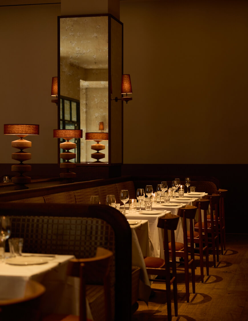
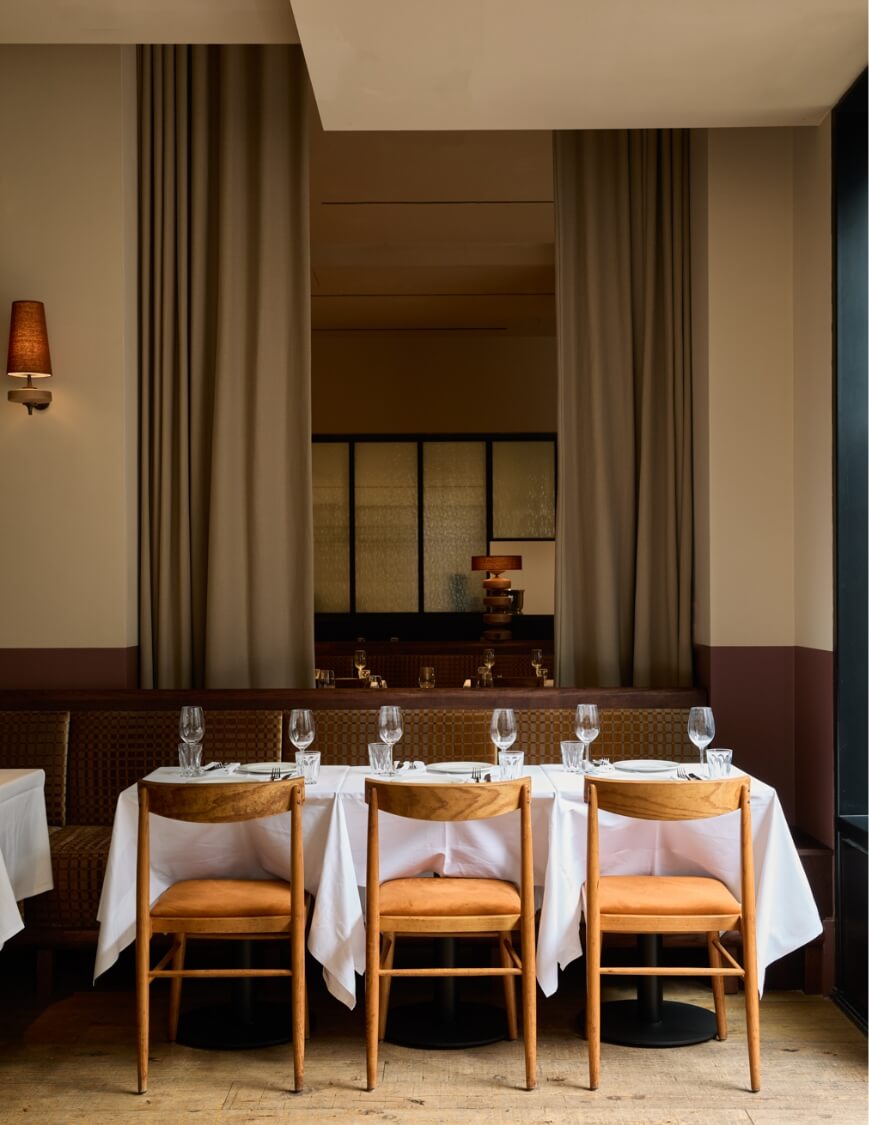
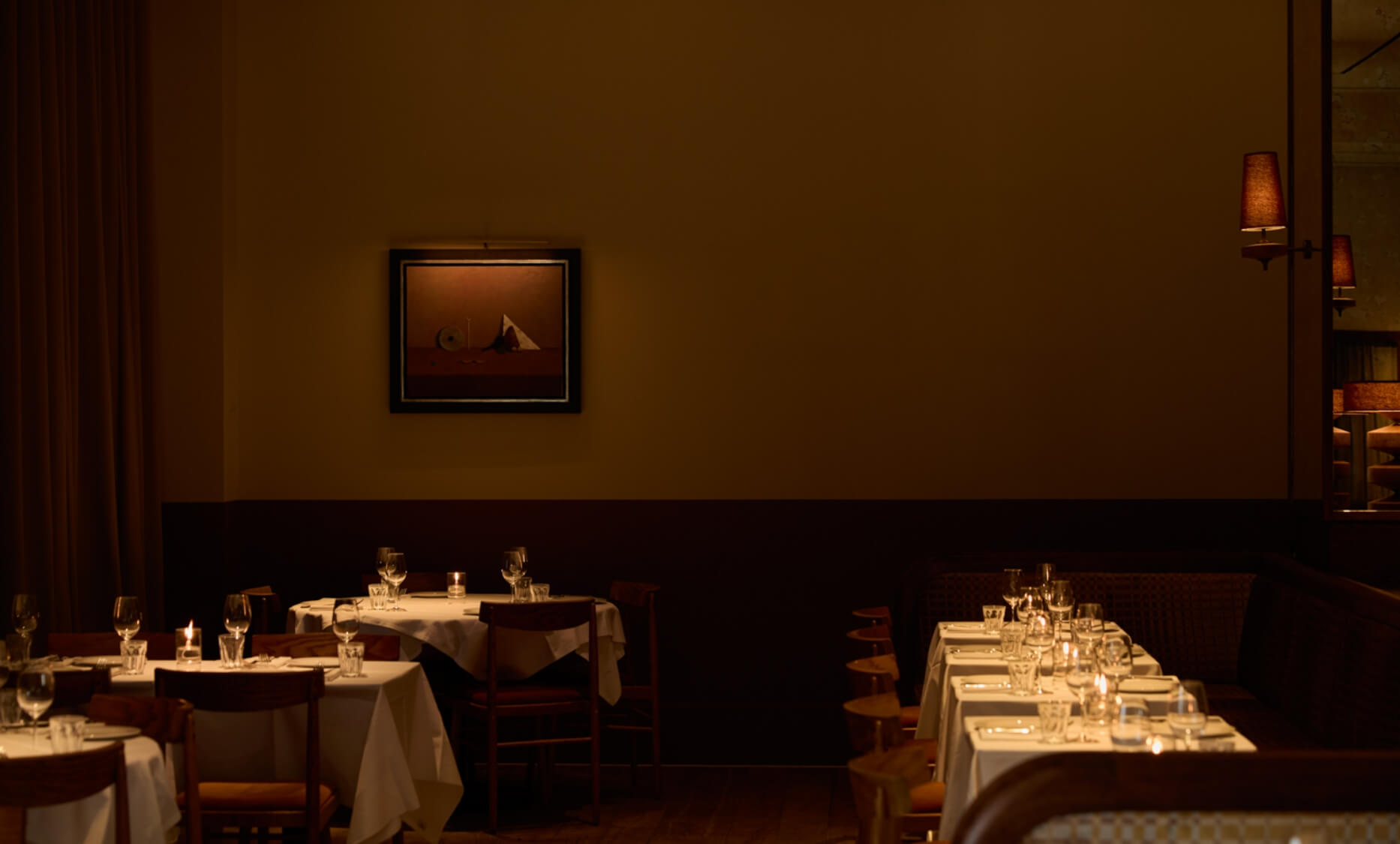
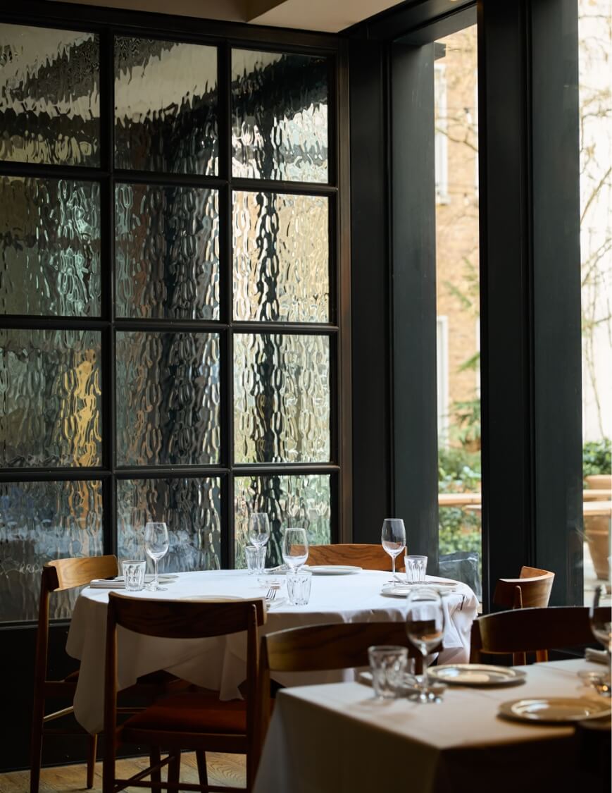
The brief held an unusual character — an Irish chef serving Italian food — and the narrative interior design needed to hold both sensibilities honestly. The mood sits between an Irish country house kitchen and a well-loved Roman trattoria, reinterpreted through a modern lens. Walls divide into two colour bands — reddish-brown below, soft yellow above — reflected in golden-hued mirrors that wrap the structural columns. The bar combines burgundy marble and concave stone tiles with a curved timber edge designed to invite touch. Lighting design by Snelling operates as a series of warm, distinct sources — sculptural table lamps and sconces — creating a sensory, atmospheric interior that shifts register as the evening progresses. The layout is quietly radical: banquettes arranged through the middle of the space rather than the perimeter, multiplying intimate corners and ensuring every cover feels like the best seat in the house.
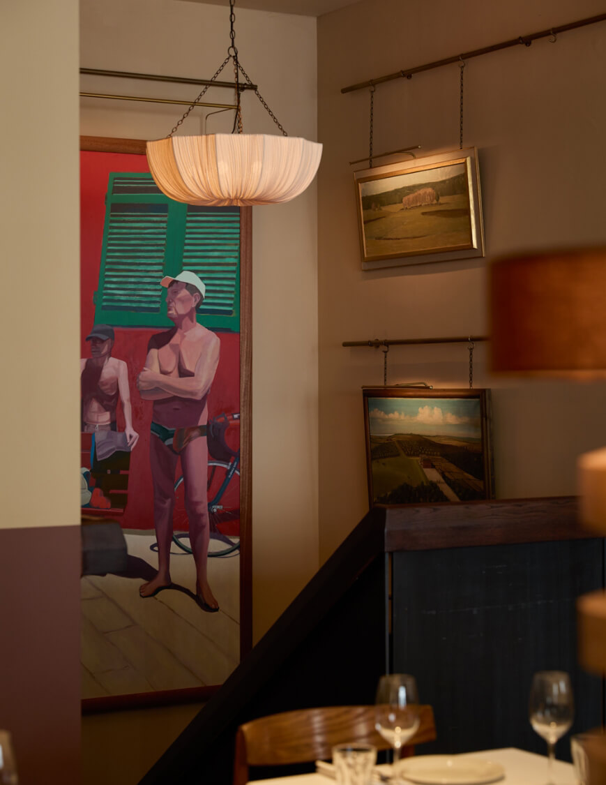
The walls carry an art-led programme of unusual generosity — a large canvas by Irish painter Dan Ferguson alongside paintings by Lisa Helmanis, placed with a painter’s understanding of how a work reads across a room. A hundred matching mid-century chairs sourced from a convent in Czechia give the room a quiet history no new manufacture could replicate.
The brand identity — a gilded italic B, calligraphic without being ornate — extends across menus, stationery, uniforms and digital. As Helmanis told Dezeen: “In a neighbourhood often characterised by spectacle and turnover, Burro positions itself as a true local — a place to return to repeatedly.”
“Burro is the opposite of brash. It’s an oasis of pristine sanity in a postcode full of fire-breathing buskers. For such a large space, it’s elegant and defiantly serene.”
Grace Dent, The Guardian